
ENG - Machine Learning based Predictive Maintenance - Part 1 : The project brief
The Pharm'AI Company - Project #5

Previously, we explored the theoretical foundations of predictive maintenance and its importance in modern industry. We examined how this approach differs from traditional corrective and preventive maintenance methods by leveraging data analysis to anticipate failures.
In this new article, we will now translate these theoretical considerations into a practical case.
Description of the Dataset Used
In my projects, I consistently seek out datasets related to the pharmaceutical industry. In this case, as I couldn't find a suitable pharmaceutical dataset, I opted to illustrate this predictive maintenance project with a dataset from the aeronautics sector1. This choice is not problematic, as the principles of predictive maintenance easily transcend industry boundaries; methodologies developed for one field can often be successfully applied to others.

The dataset I selected tracks a fleet of about one hundred aircraft turbines, each equipped with 21 different sensors. A measurement is recorded for each of these 21 sensors over the operating cycles of the turbines. Thus, for each turbine, we obtain a multivariate time series.
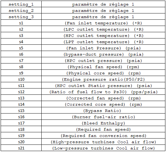
In addition to sensor values, the training dataset includes a metric for each record called Time-To-Failure (TTF), which is the number of cycles remaining until the next failure occurs.
The Time-To-Failure is a numerical value, and there are two ways to handle it:
We can retain its numeric nature, creating a regression problem where we aim to predict the number of cycles remaining until the next failure.
Alternatively, we can transform this measure into a categorical variable with risk thresholds, creating a classification problem.
I chose the second option as it allows us to build simple, understandable operational rules. I thus transformed TTF into three categories:
High failure risk (if TTF < 30 cycles),
Moderate failure risk (if 30 ≤ TTF < 50 cycles),
No failure risk, representing standard machine operation (if TTF ≥ 50 cycles).
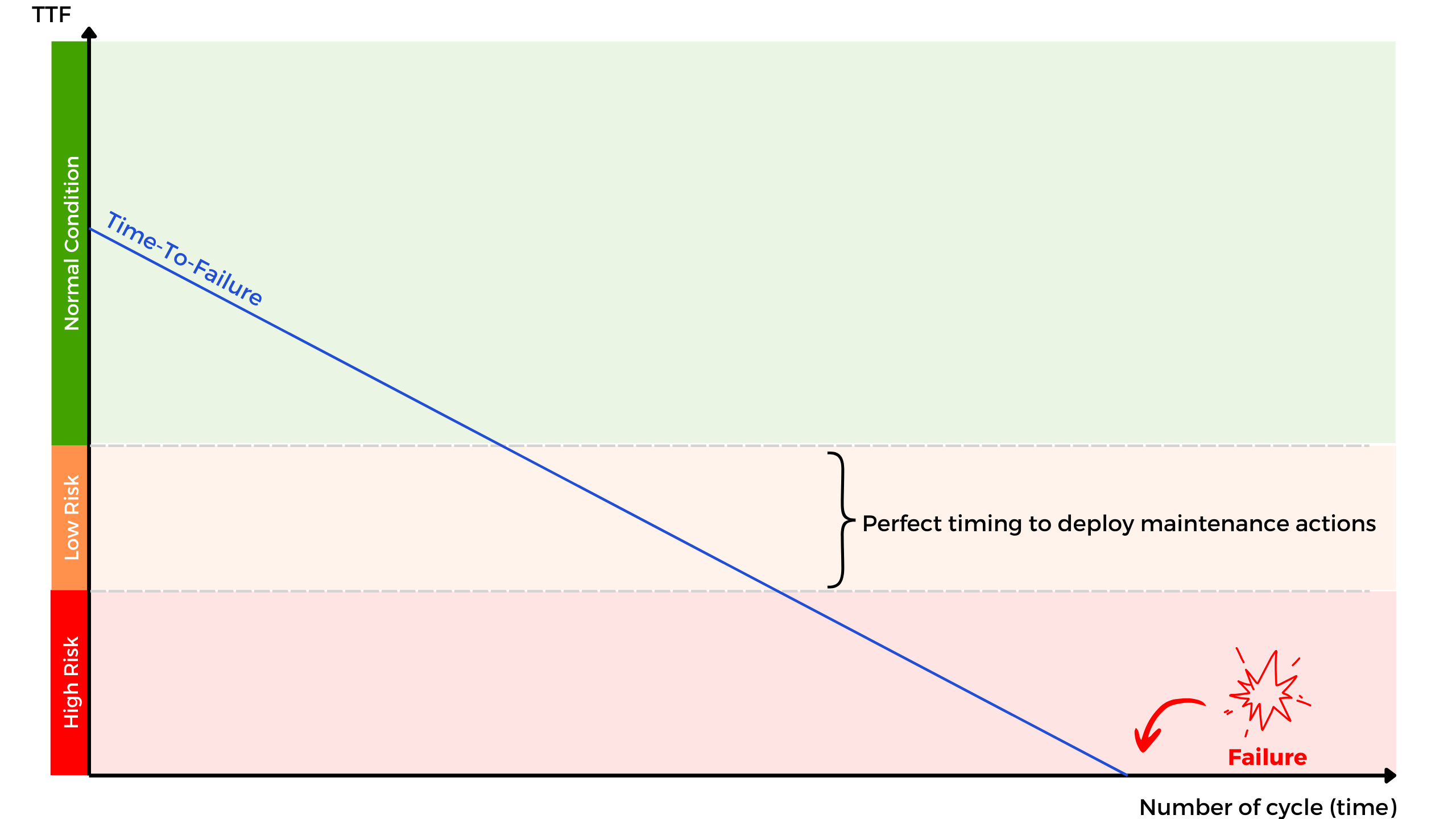
The core objective of our project is to predict, based on sensor configurations, the risk zone in which the equipment is operating.
Analyzing the Dataset
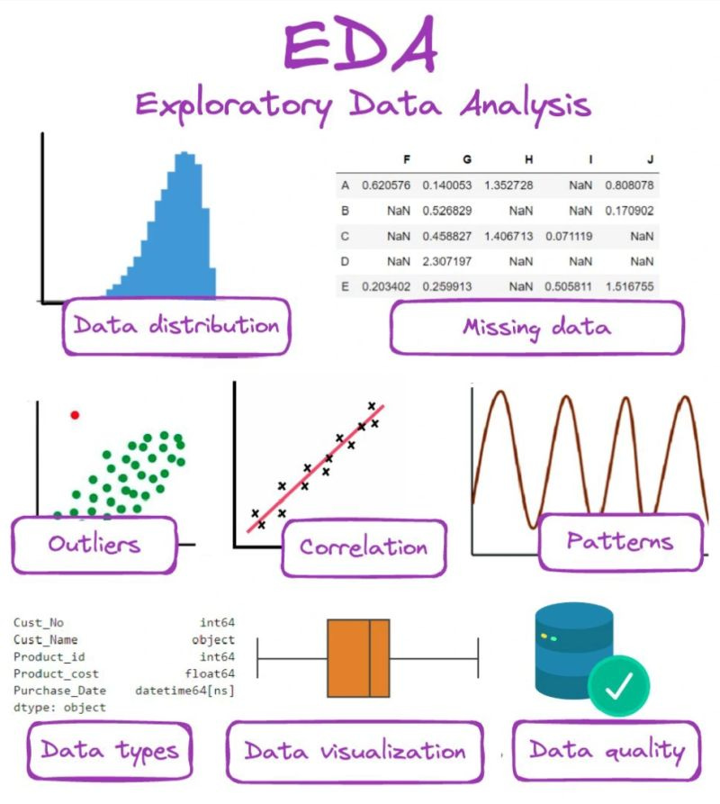
What is Exploratory Data Analysis?
Exploratory Data Analysis (EDA) forms one of the foundational steps of any data science project.
The tools we use to conduct EDA are often very simple: histograms, graphs, tables, etc2. However, this step, sometimes underestimated, is essential because it allows us to:
Understand the structure and nature of our data,
Visualize the distributions of different parameters,
Check data quality, enabling us to clean missing or aberrant values as needed,
Identify potential correlations between different sensors.
Indeed, the Data Scientist’s role when modeling a phenomenon is not limited to deploying a “standard” approach; it is always necessary to characterize the data and adapt preprocessing and modeling steps accordingly.
NB: The EDA process can be a bit tedious, and the purpose of this article is not to delve into it exhaustively. I will provide selected highlights here; the full EDA is available in this notebook on my GitHub repository3.
1. Data Types
A good initial practice when starting an analysis is always to display the variable types and basic statistics in data tables.
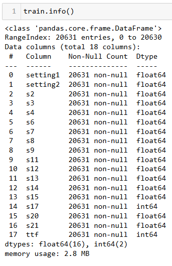
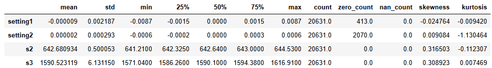
Conclusions:
Our dataset is relatively clean and contains no missing values that need to be addressed.
The sensors provide numerical data, with no categorical variables.
Some parameters do not vary over the cycles, so I chose to exclude them from the study.
2. Univariate Statistical Analysis
Univariate analysis is a method used to examine the distribution of a variable in order to understand its fundamental characteristics, such as mean, median, or standard deviation. It allows us to detect trends, dispersions, and outliers, providing an overview of the parameter’s behavior in isolation.
Since the dataset contains only continuous variables, I displayed them as histograms. Here is the result:
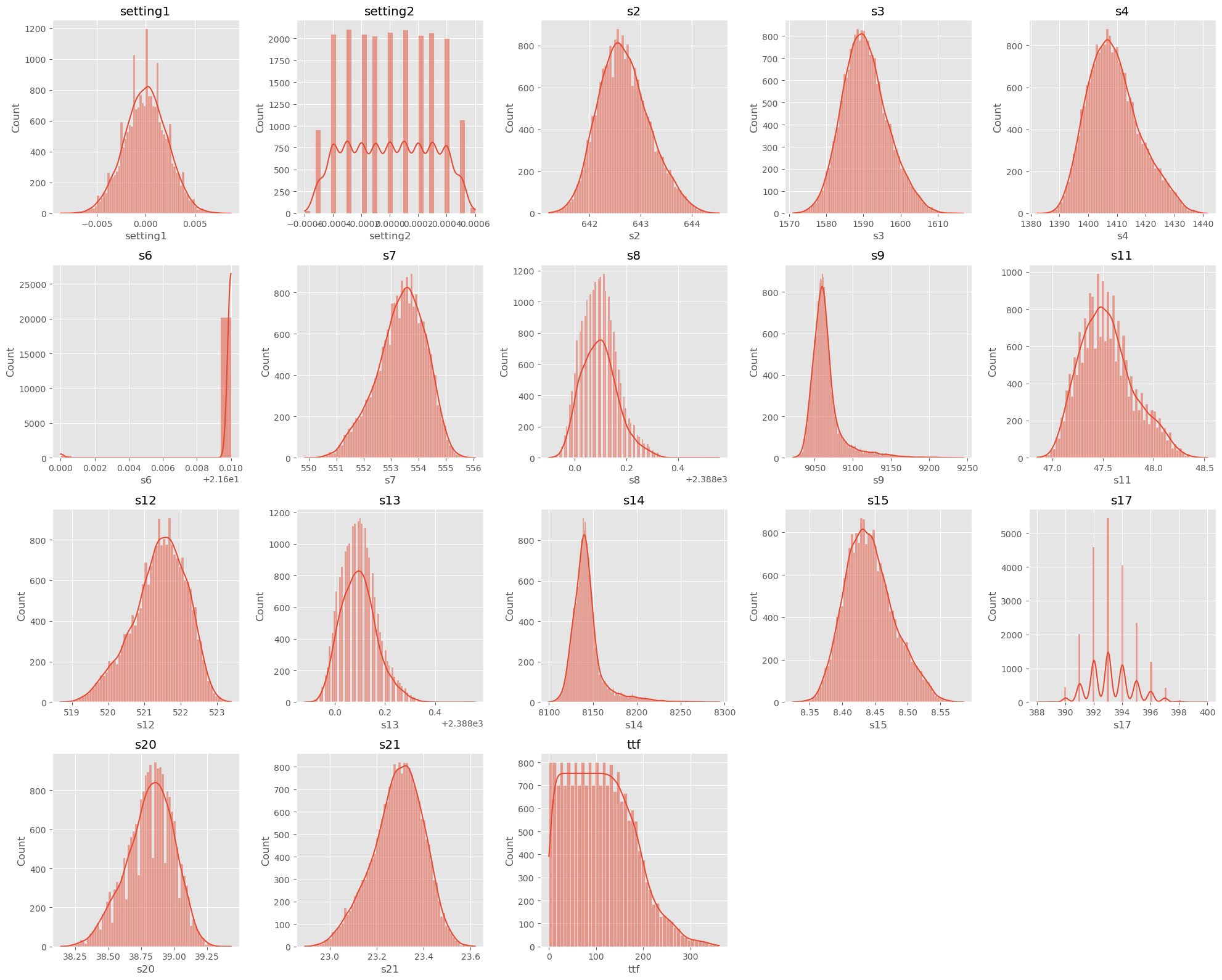
Conclusions:
The dataset does not contain significant outliers, except perhaps for sensor s6, which shows some atypical values.
Some variables appear to follow a normal distribution, while others show strong asymmetry (see Kurtosis and Skewness scores4). Preprocessing, including correction (such as logarithmic transformation) and normalization, will be necessary before proceeding to the modeling phase.
3. Bivariate Statistical Analysis
Bivariate analysis examines the relationship between two variables to determine whether an association or correlation exists between them.
Below is the correlation matrix showing the existing correlations between each pair of parameters.
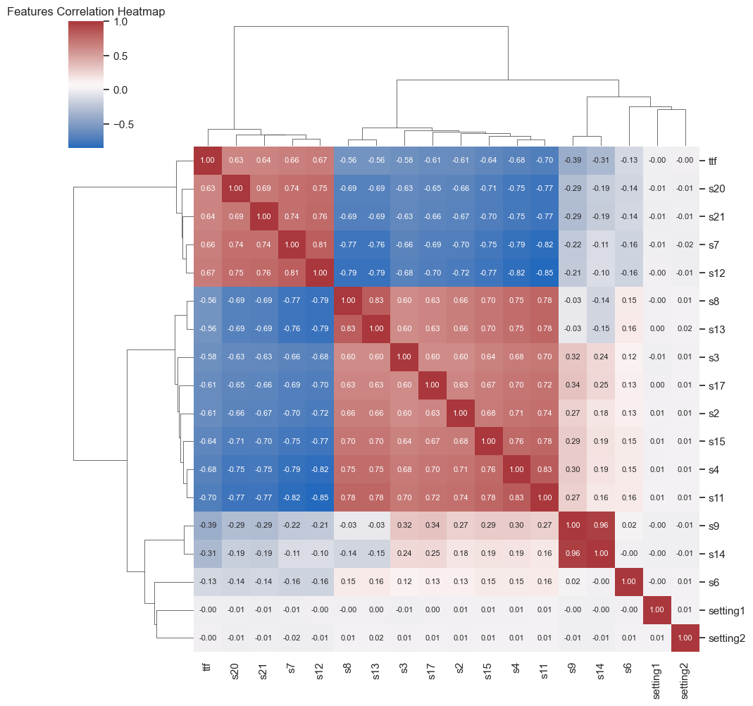
Conclusions:
Several parameters show a strong correlation (positive in red or negative in blue) with our target variable, Time-To-Failure.
Some parameters are strongly correlated with each other; for instance, s9 and s14 actually measure the same physical quantity.
We refer to this as multicollinearity when there are strong correlations between variables. This is an important point to consider for the next phases of the project, as several modeling algorithms are sensitive to this phenomenon, which can affect their performance and interpretability.
To address this phenomenon, it is often necessary to select the most representative features (variables) or apply dimensionality reduction techniques.
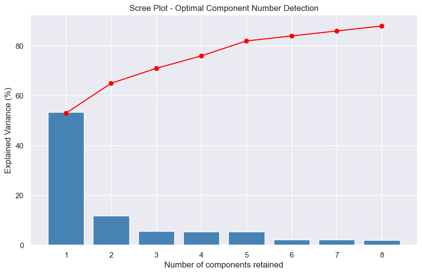
4. Principal Component Analysis
Given the complexity of a dataset with more than twenty columns, Principal Component Analysis (PCA) becomes a valuable tool for visualizing the underlying phenomena. NB: I previously covered this tool in the article on CPV 4.0.
PCA5 is a statistical method that, through projection into a new mathematical space, simplifies data complexity while retaining its essence. In other words, it reduces the number of variables to be studied, keeping those that best explain data variation.
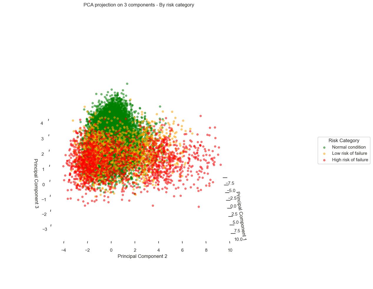
As shown in the graph below, called a "Scree plot"6, PCA reveals that with only three principal components, we capture nearly 70% of the total data variance - with the first component alone explaining 53% of this variance.
By applying a 2D PCA, the results are as follows:
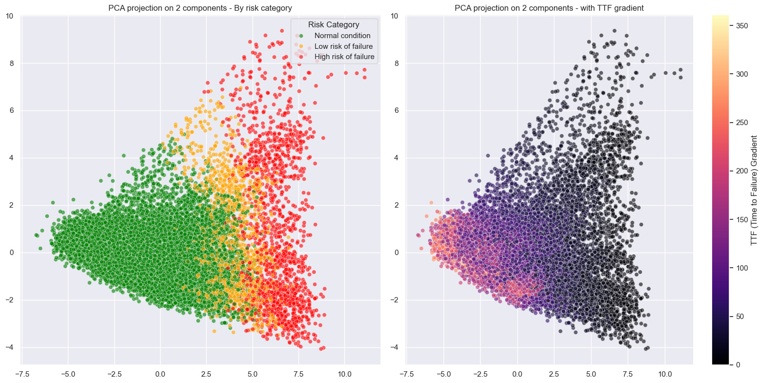
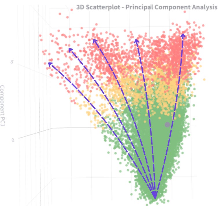
We observe a scatter plot, with each point corresponding to a different data record. When overlaying the failure risk on these visuals, a pattern emerges from the data:
Records corresponding to optimal turbine performance (green) cluster distinctly on the left side of the chart.
In contrast, records corresponding to pre-failure states (orange and red) gradually shift to the right.
Looking more closely, we even see distinct trajectories, revealing different degradation behaviors depending on the turbines.
Conclusion
The exploratory analysis phase highlighted and confirmed the potential of our data while validating the feasibility of our project: to detect early signs of failure. The dimensionality reduction achieved through PCA provided a clear view of equipment degradation dynamics.
In the final article in this series, we will explore how to model our process and create a concrete prediction tool capable of alerting maintenance teams before critical failures occur.
Feel free to check out the complete notebook on my GitHub to discover all EDA steps and share your feedback!
… Let’s rock with data … 🎸